Custom Enrollment and Learning Plan Reports enable you to display the output in a chart. One of the chart options is a donut chart.
Donut charts are circular and enable you to view the relationship of each data series to the whole. In the example below, the donut chart illustrates the number of enrollments by group. Each color in the chart represents the number of enrollments for a group.
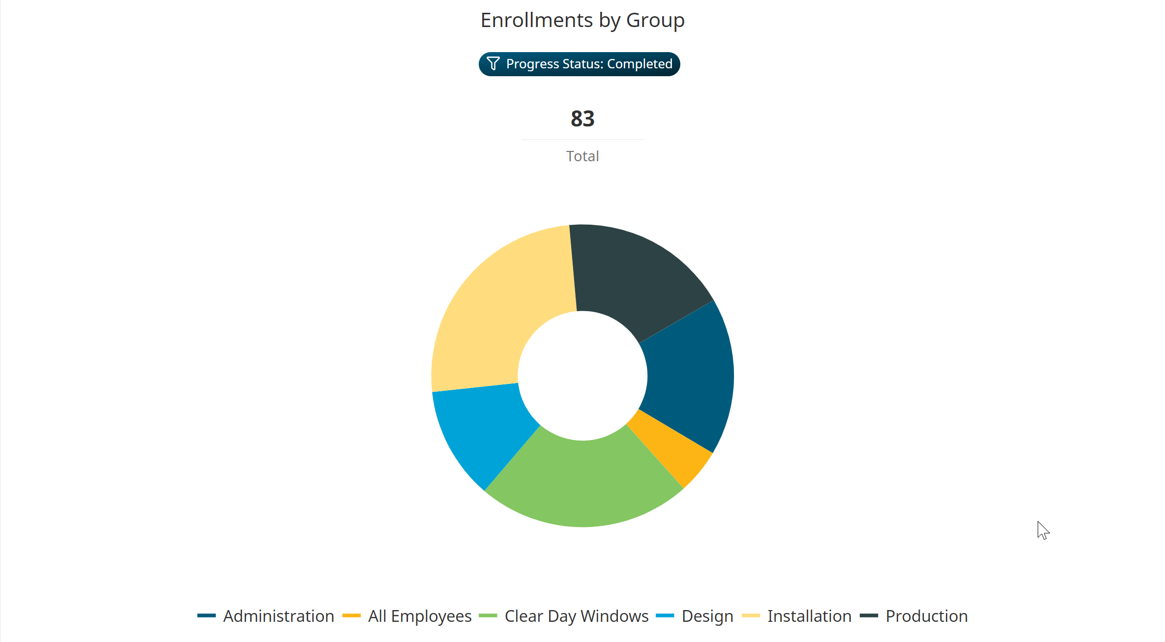
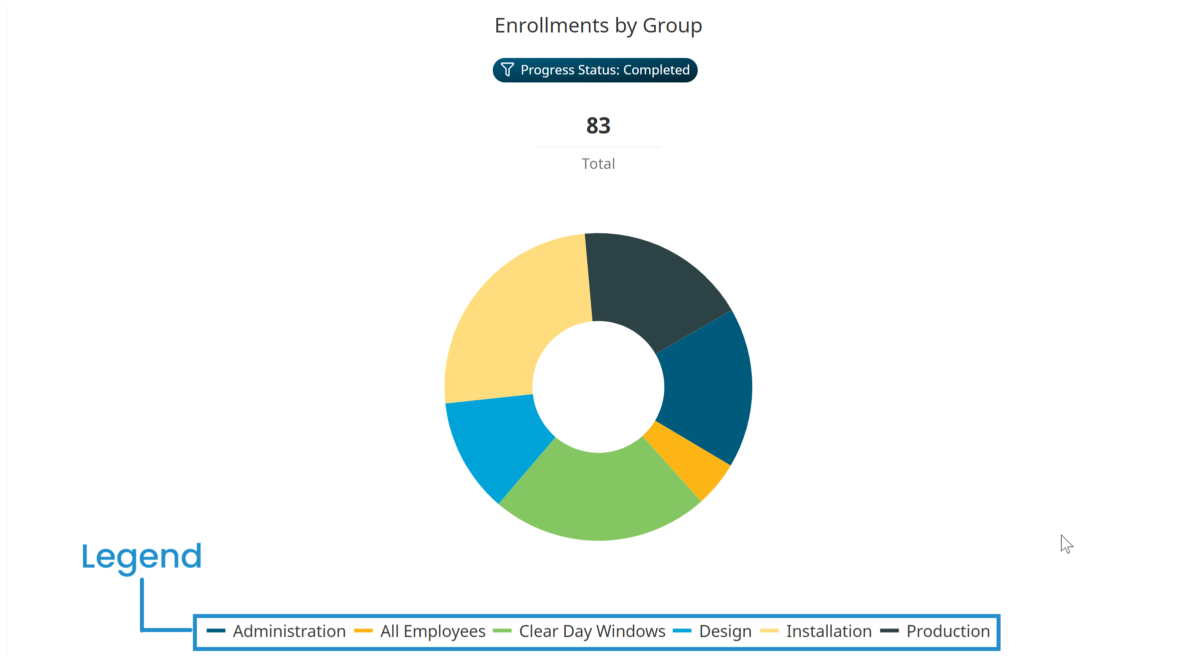
Below the donut chart is a legend that displays the data series included in the chart.
Understanding the Donut Chart's Heading
A donut chart's heading consists of the report's title and the report's filters.
For custom Enrollment Reports, the chart's title will be in the format Enrollments by <GroupByColumn> where <GroupByColumn> is the column that you selected from the report's Group Output By setting.
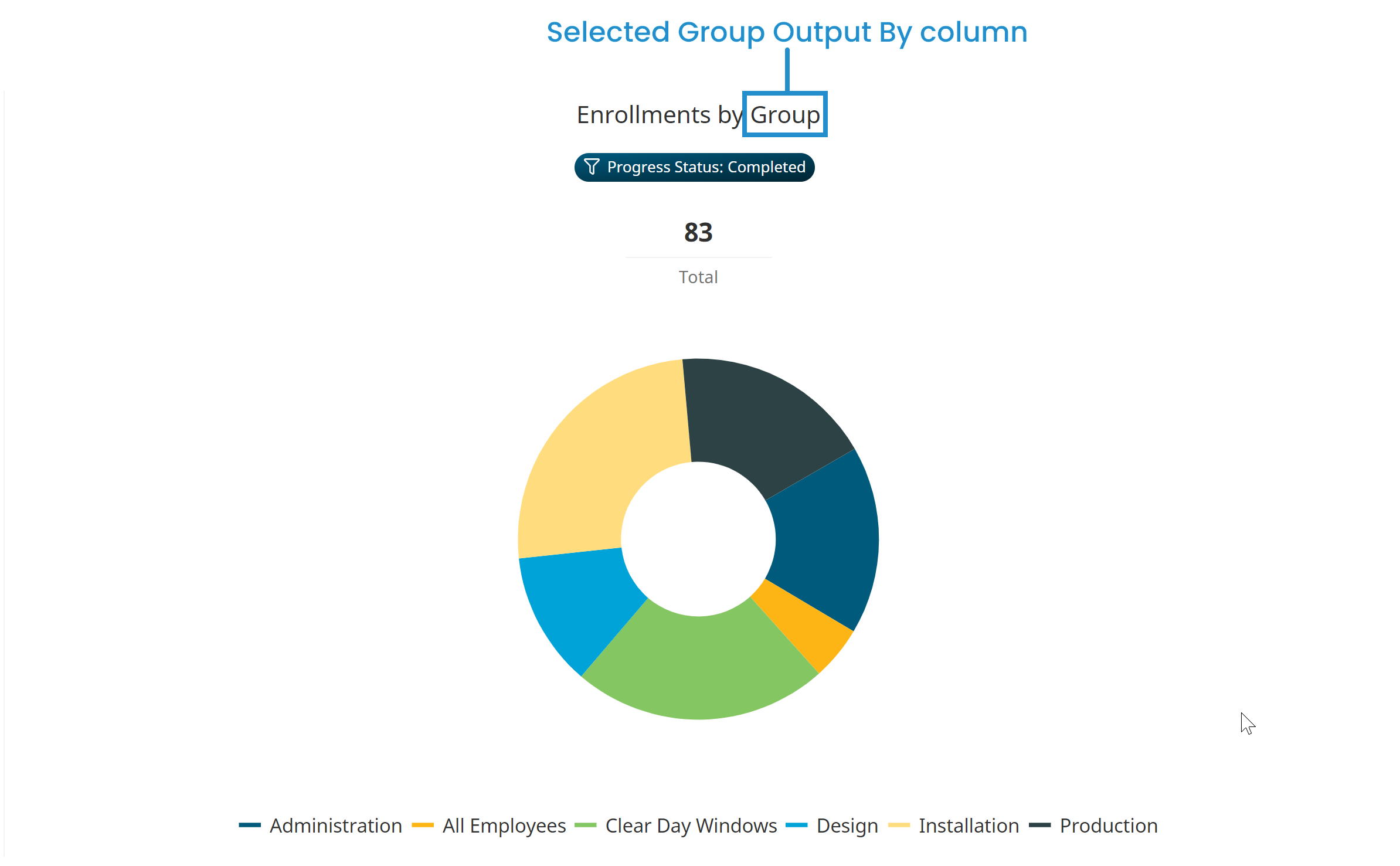
For custom Learning Plan Reports, the chart's title will be in the format <Level> by <GroupByColumn> where:
- <Level> is the Level selected from the report's Type accordion
- <GroupByColumn> is the column selected from the report's Group Output By setting
.png)
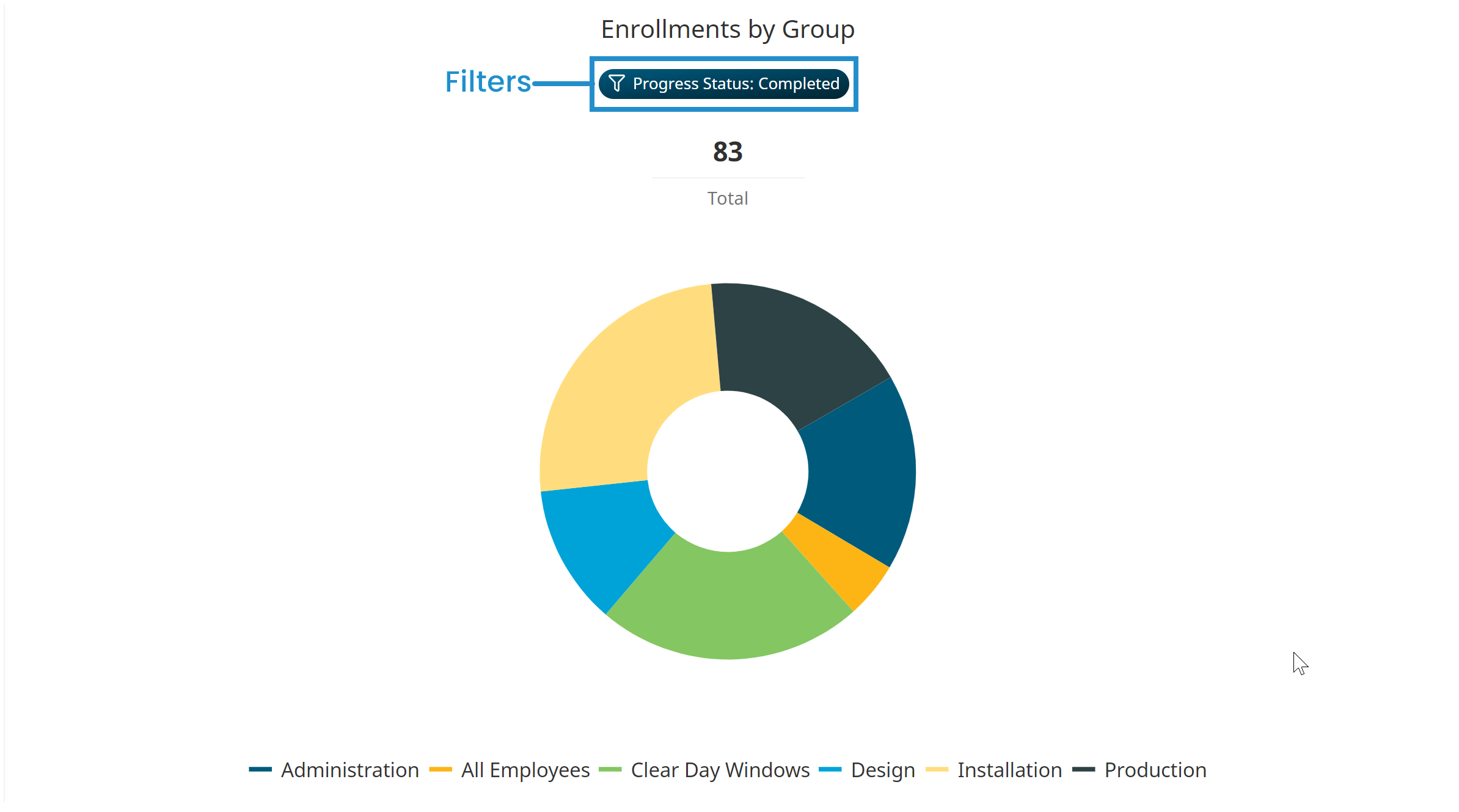
Any filters specified for the custom Enrollment Report or custom Learning Plan Report display below the chart title.
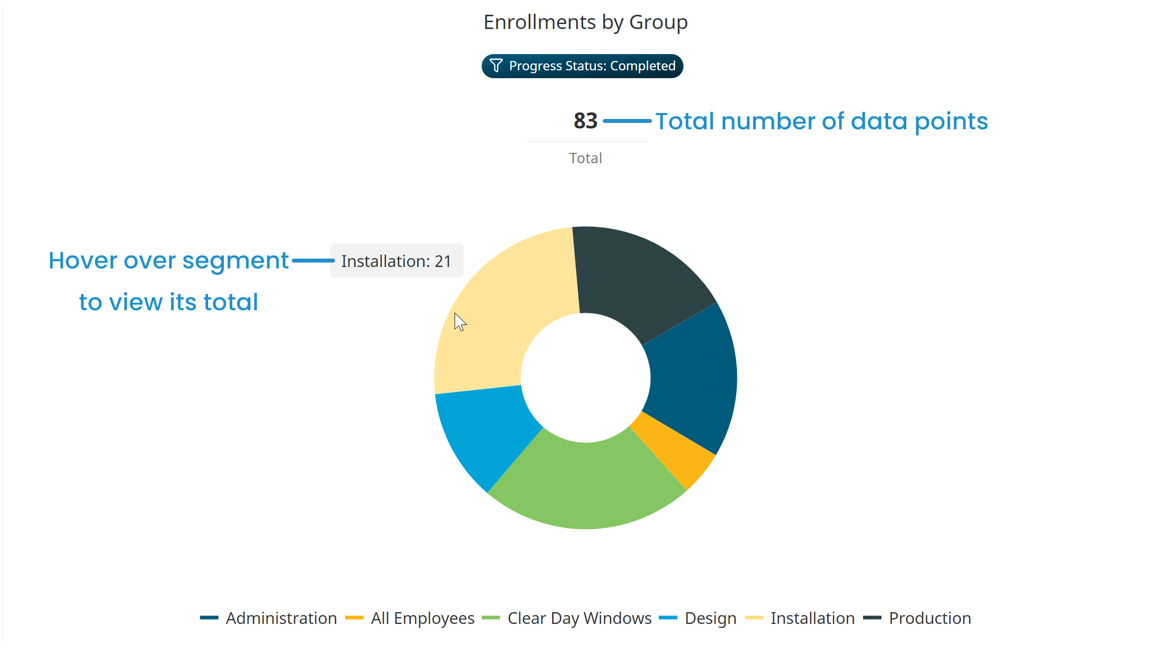
Viewing a Segment's Total
The total number of data points represented display just below the heading and above the donut chart. Hover over a segment of the donut chart to view the segment's total.
Hiding a Data Series
You can temporarily hide a data series from the donut chart by clicking the data series name in the legend. The example below illustrates how the donut chart changes when the Administration data series is hidden/displayed.
Hidden data series names display in gray in the legend.
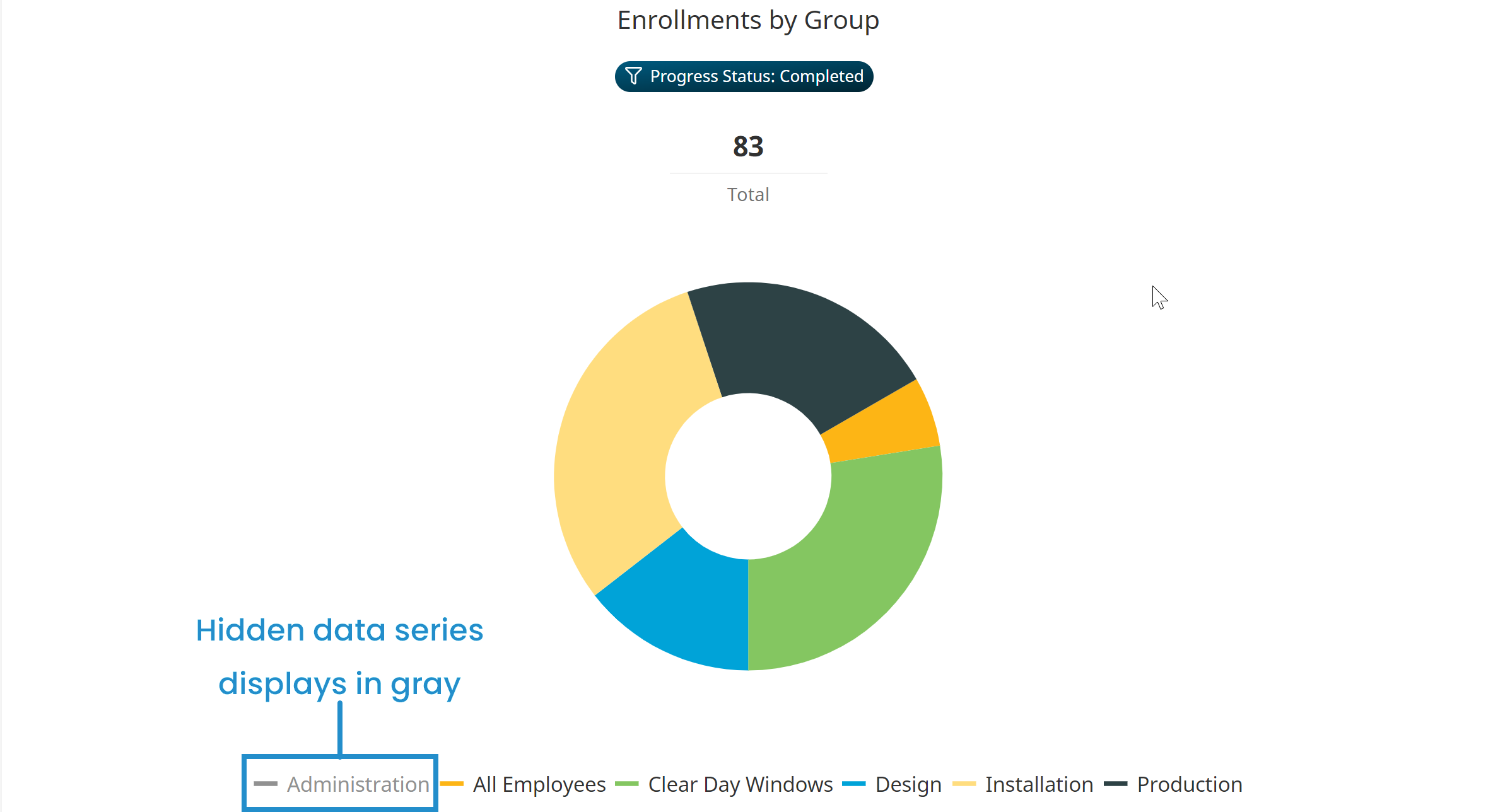
To re-display the data series in the donut chart, click the data series name in the legend.