Custom Enrollment and custom Learning Plan Reports enable you to display the output in a chart. One of the chart options is a stacked chart.
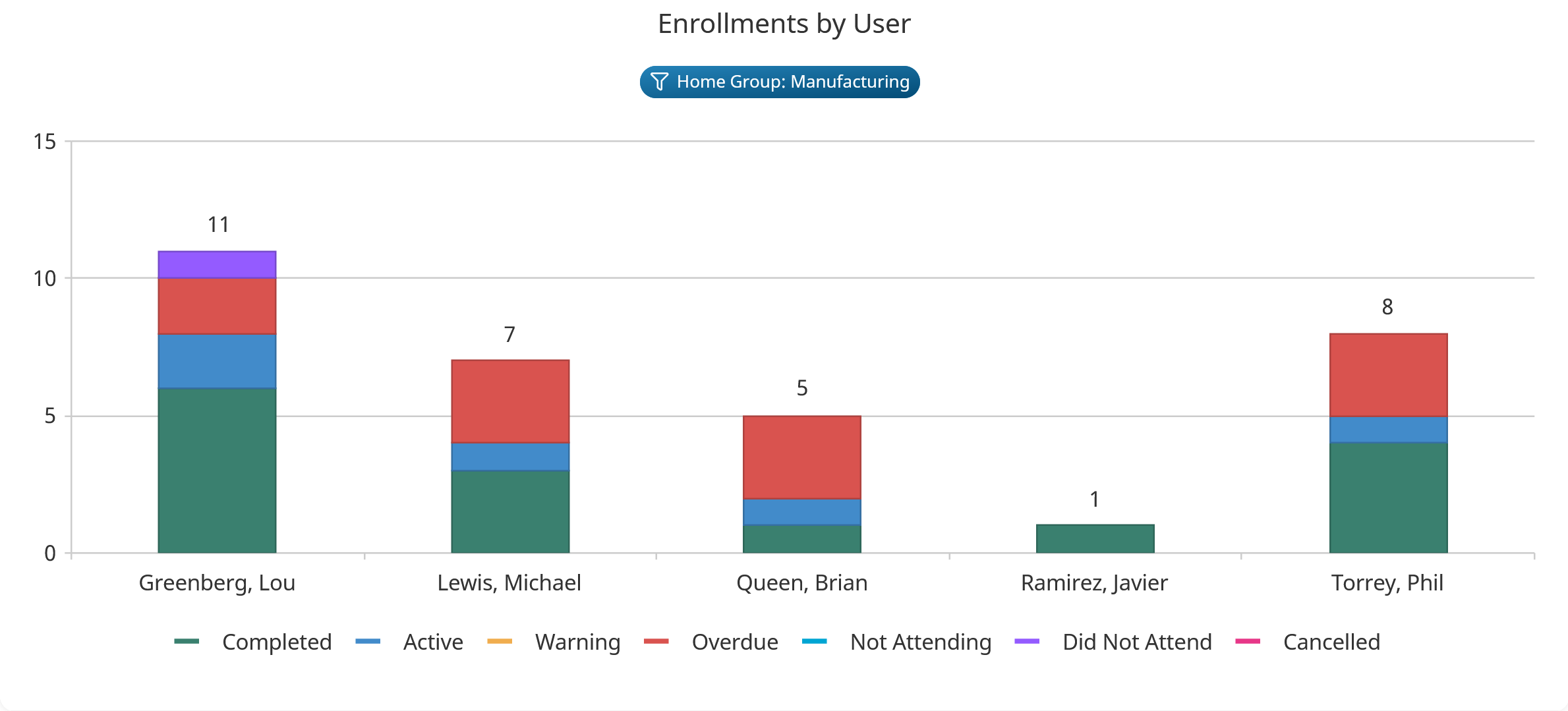
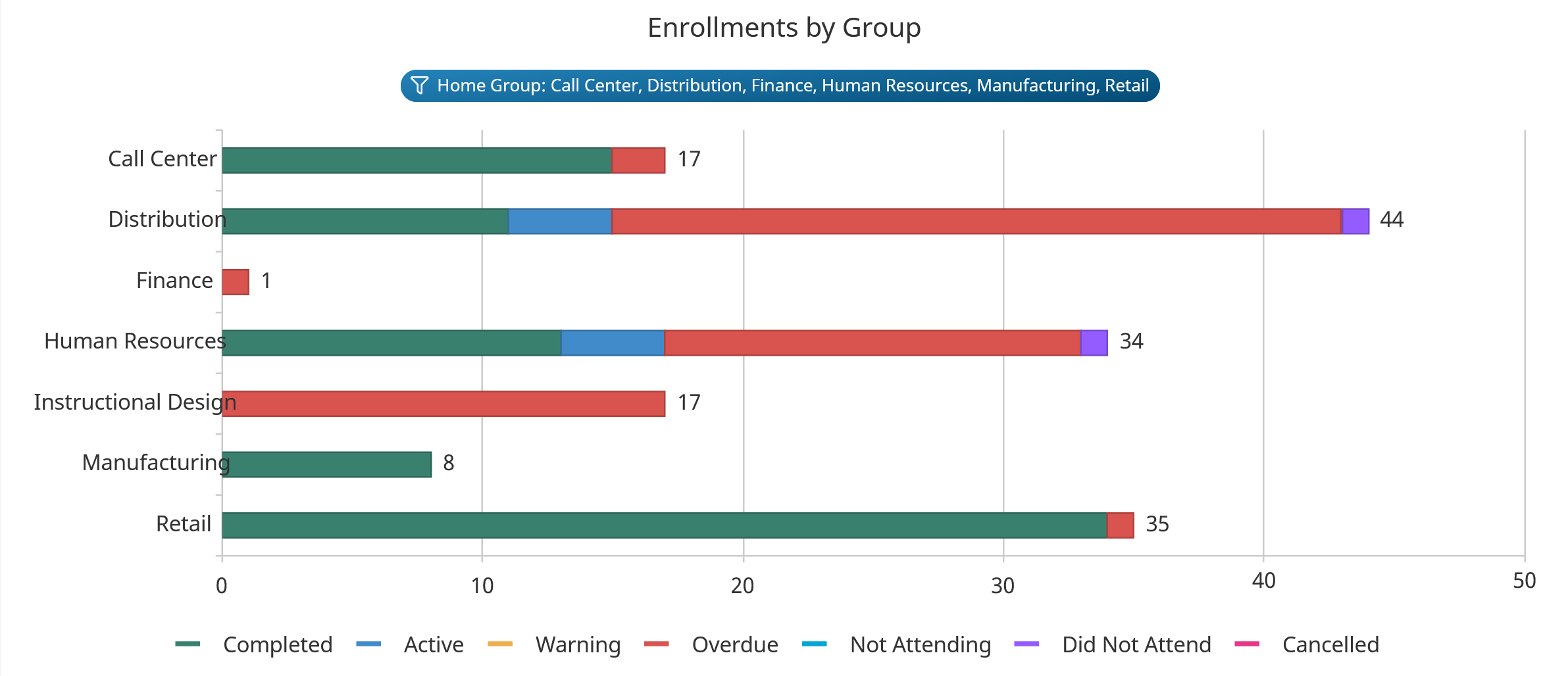
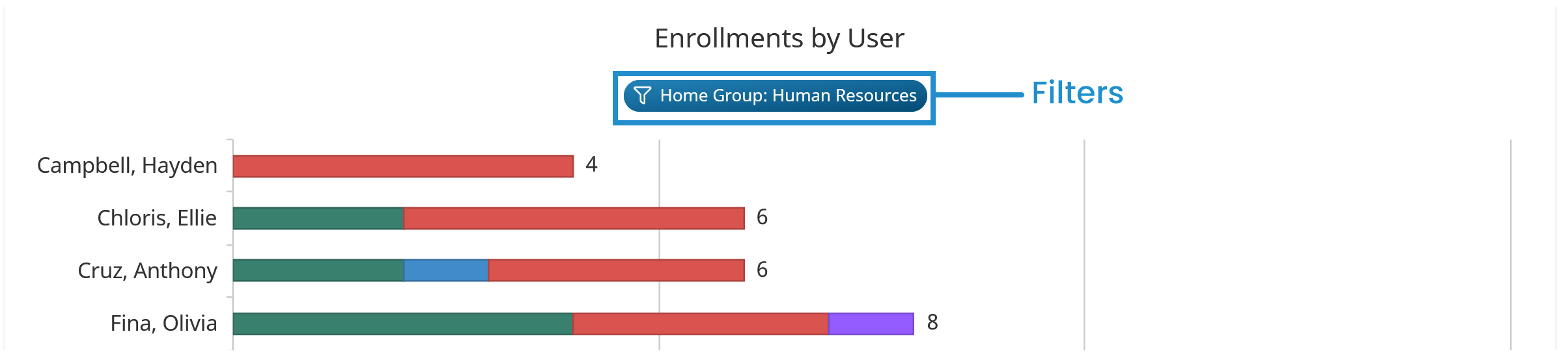
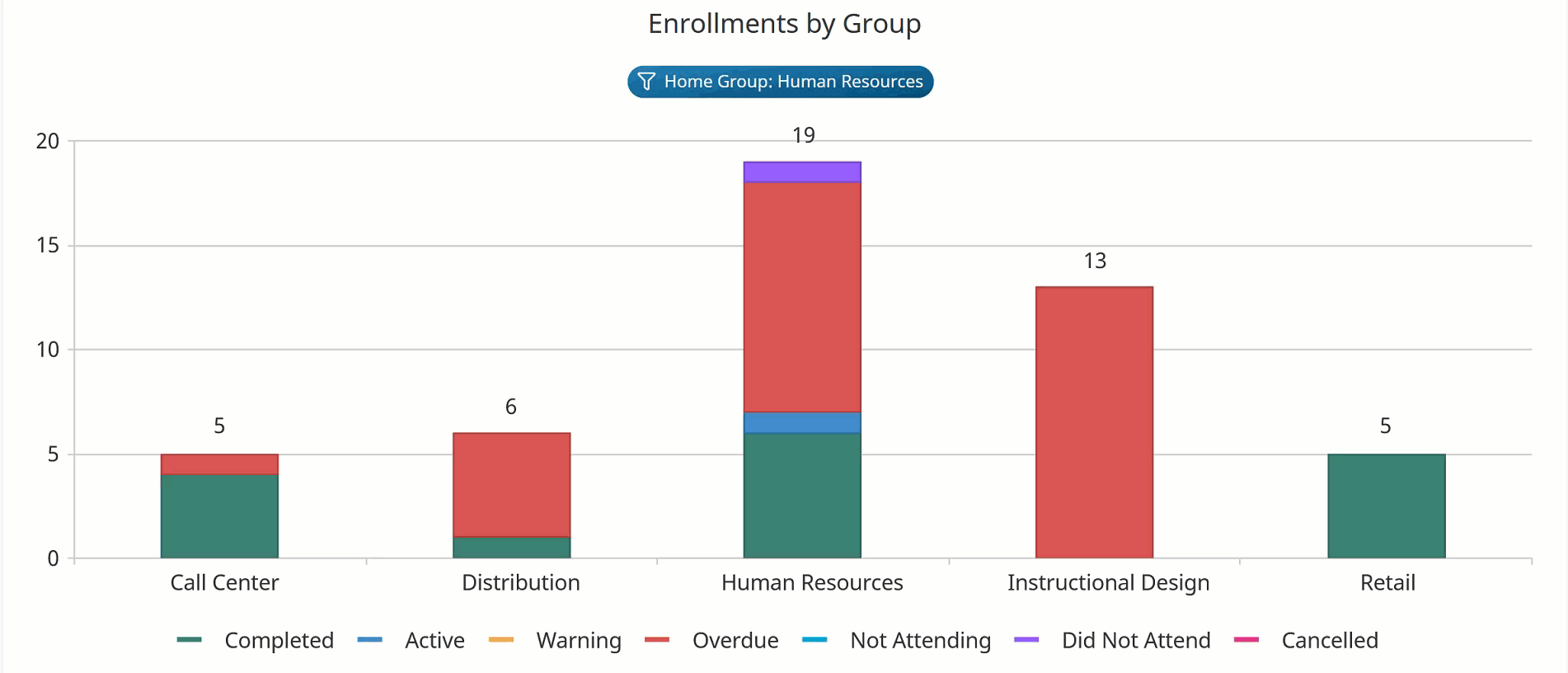
Stacked charts are similar to bar charts in that they display rectangular bars with lengths proportional to the values that they represent. However, they also enable you to view different categories within each data series. In the example below, each bar represents the total number of enrollments for each user. Within each bar, the user's enrollments are colored to reflect the enrollment status.
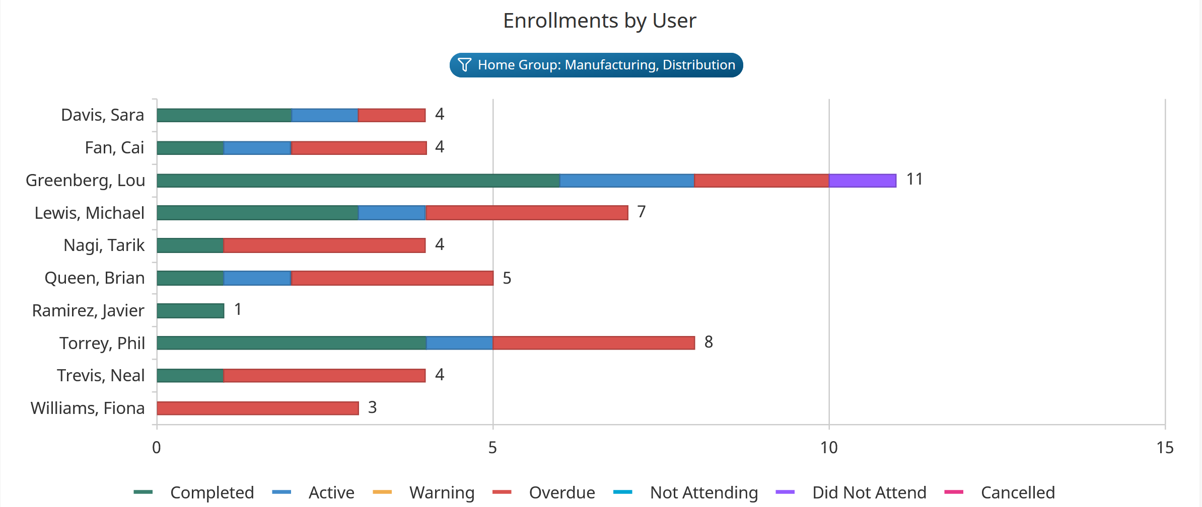
The orientation of the bar chart is automatically determined by SmarterU based on the number of data series. If the chart contains five or fewer data series, the orientation of the bar chart is horizontal.
If the chart contains six or more data series, the orientation of the chart is vertical to make the chart easier to view. If the chart has 15 or more data series, the height of the chart will also increase to accommodate all the data series.
Understanding the Stacked Chart's Heading
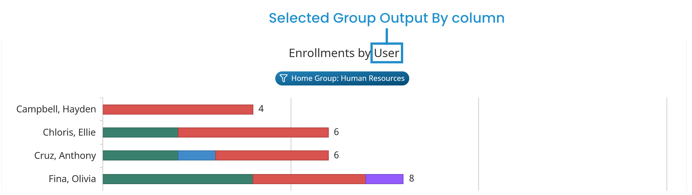
A stacked chart's heading consists of the report's title and the report's filters.
For custom Enrollment Reports, the chart's title will be in the format Enrollments by <GroupByColumn> where <GroupByColumn> is the column that you selected from the report's Group Output By setting.
For custom Learning Plan Reports, the chart's title will be in the format <Level> by <GroupByColumn> where:
- <Level> is the Level selected from the report's Type accordion
- <GroupByColumn> is the column selected from the report's Group Output By setting
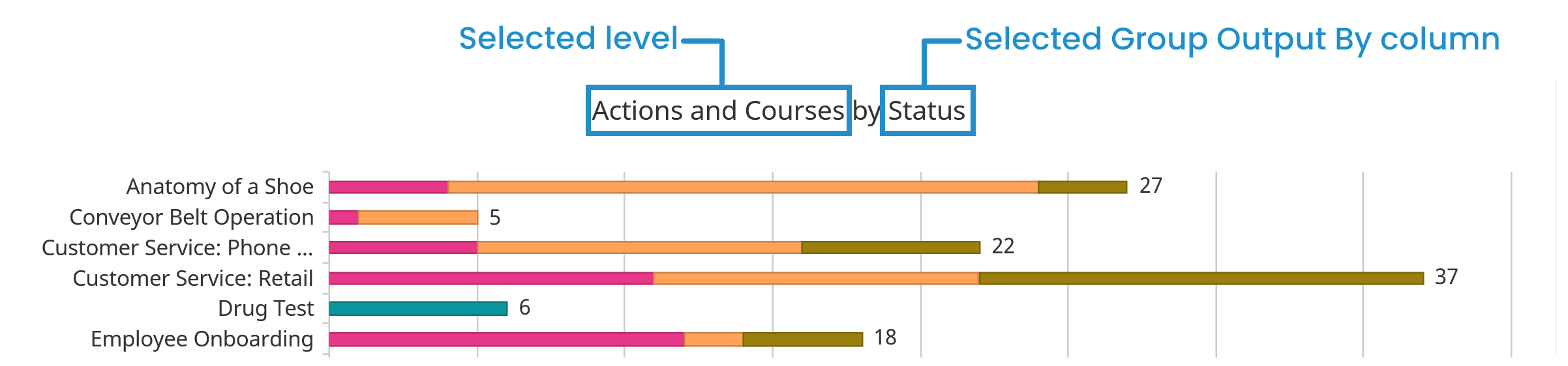
Any filters specified for the report display below the chart title.
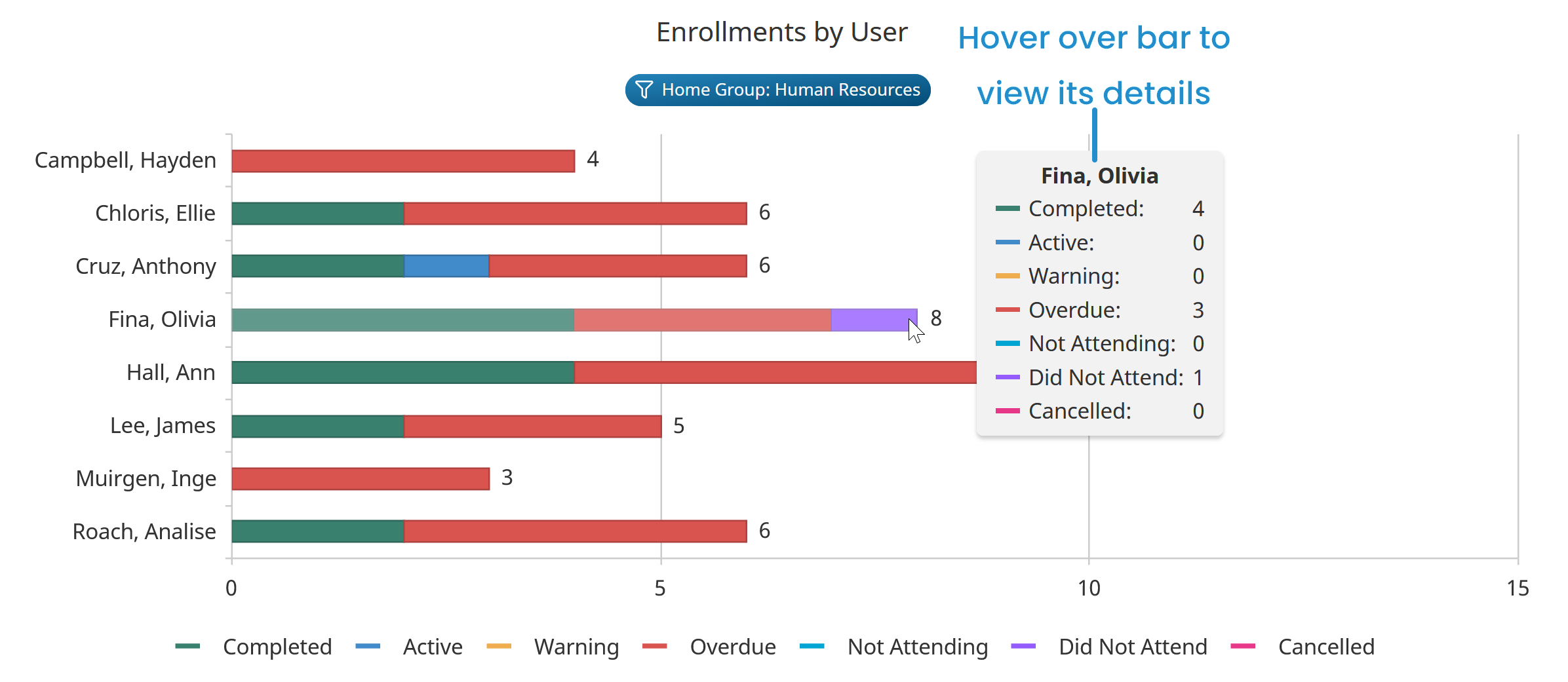
Viewing a Bar's Details
Hover over a bar to view the bar's details.
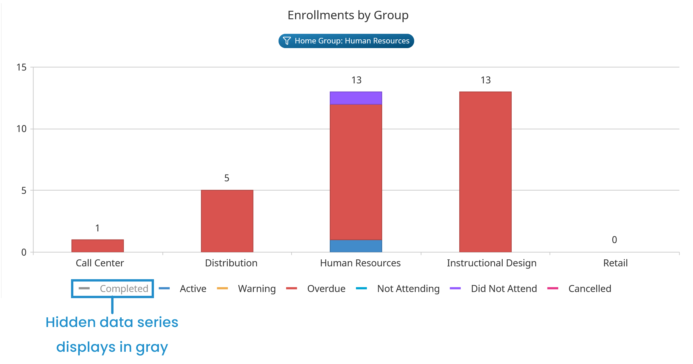
Hiding a Data Series Category
You can temporarily hide a data series category from the stacked bar chart by clicking the data series name in the legend. The example below illustrates how the chart changes when Completed enrollments are hidden/displayed.
Hidden data series categories display in gray in the legend.
To re-display the data series category in the chart, click the data series category name in the legend.