The available form widgets and their settings are described below.
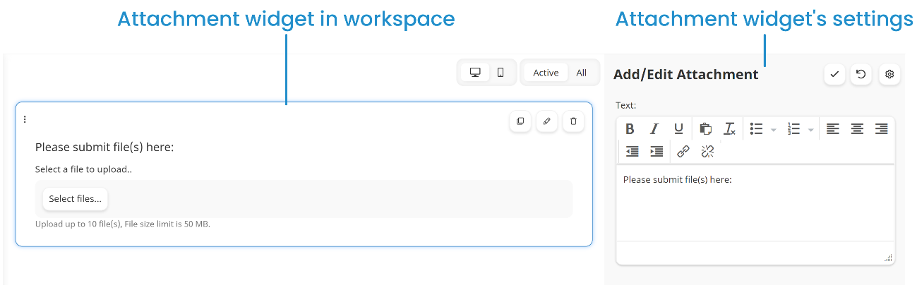
Attachment
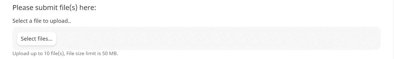
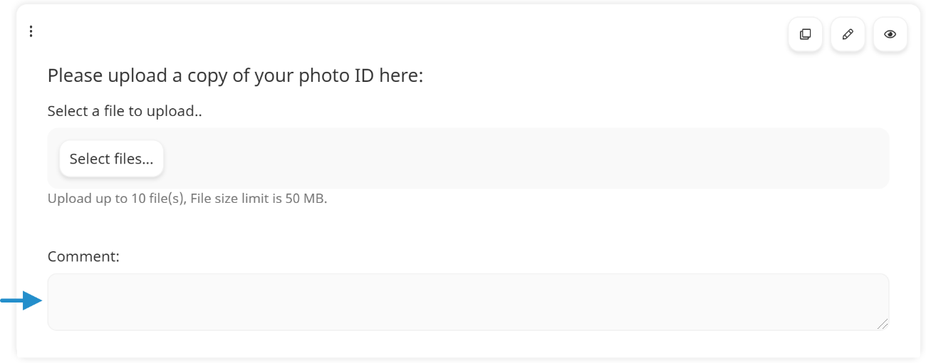
The Attachment widgets enables the recipient to upload and submit files with the form.
You can edit the Attachment widget's settings that are listed below.
 to access some of the settings below.
Text
The instructions that display above the controls for the Attachment widget.
Status
If enabled, the widget displays on the form.
Required
If enabled, the learner must upload at least one attachment before they can submit the form.
Restrict Number of Files
If enabled, you can limit the number of files that the learner can upload to the form.
Files
This setting is only available when the Restrict Number of Files setting is enabled. Enter the maximum number of files a learner can upload to the form.
Prompt for Comment
If enabled, an additional field displays where the learner can enter text about the attachment.
Required
If checked, the learner must enter a comment for the attachment before they can submit the form.
Divider
The Divider widget inserts a horizontal line in the form.
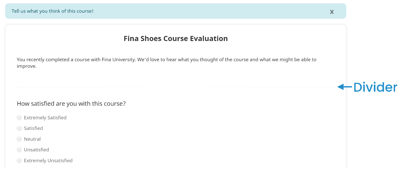
The Divider widget does not have settings.
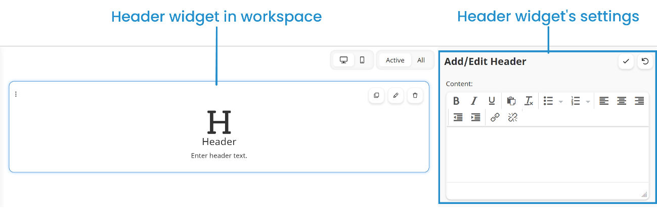
Header
The Header widget inserts a title in a form.
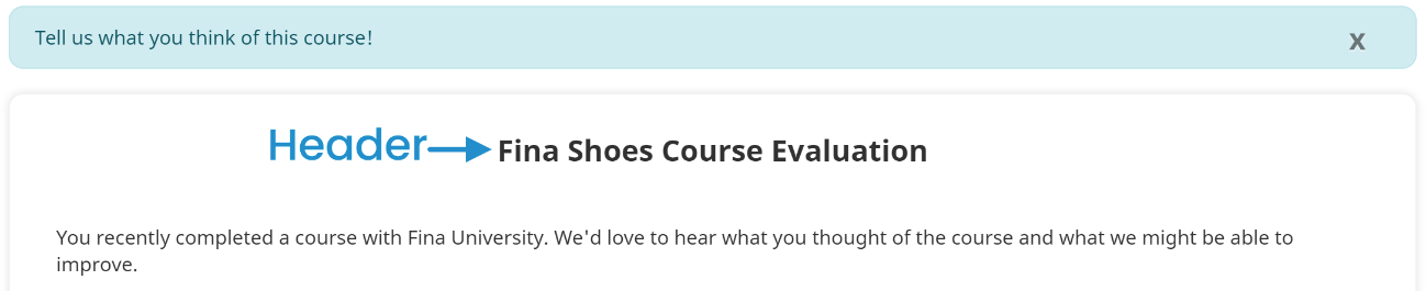
You can edit the Header widget's text to provide a title.
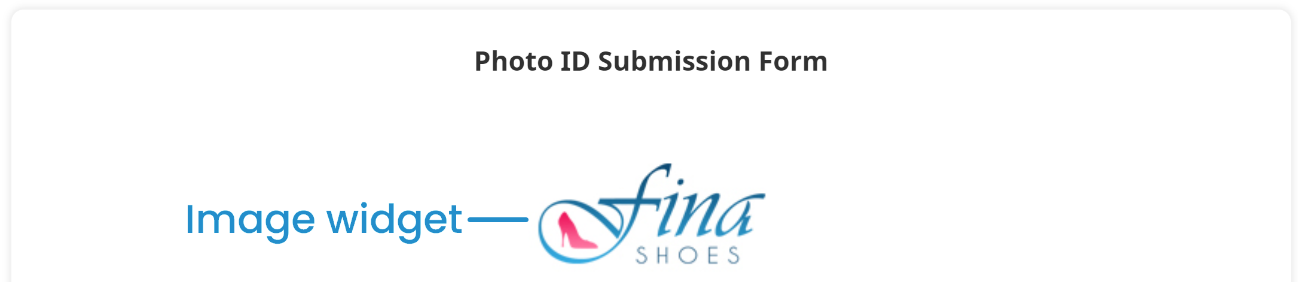
Image
The Image widget inserts the selected graphic in the form.
You can edit the Image widget's settings that are listed below.
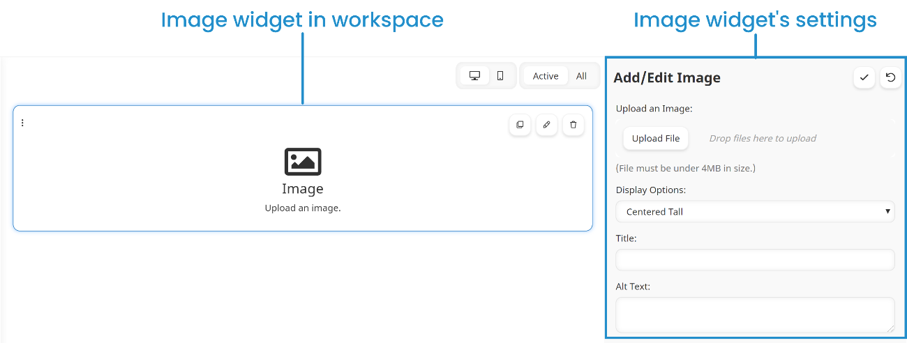
Upload an Image
To upload a graphic file, click Upload File.
Display Options
Select how you would like the image to display on the form:
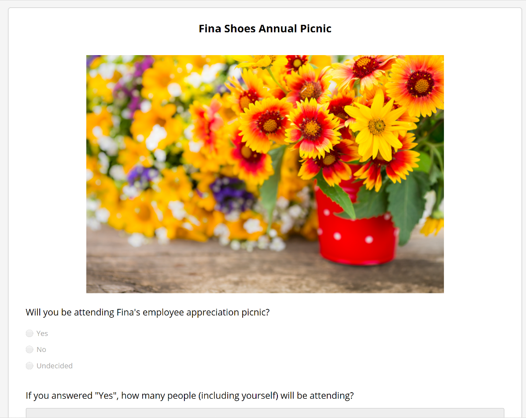
- Centered Short - Horizontally centers the image at 30% of the learner's screen height using the image's original aspect ratio.
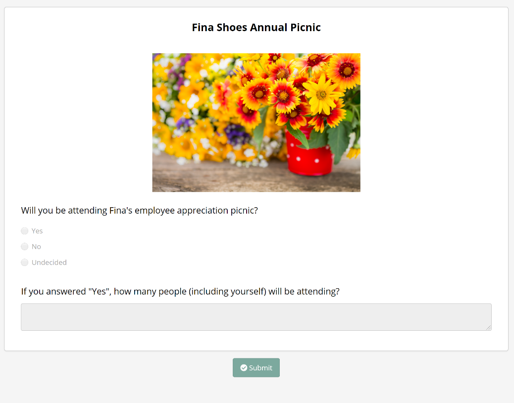
- Centered Tall - Horizontally centers the image at 50% of the learner's screen height using the image's original aspect ratio.
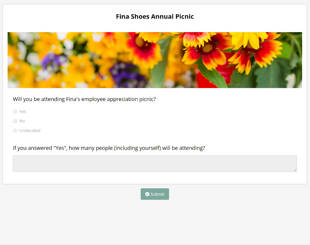
- Banner Short - Displays the image at 30% of the learner's screen height using the full width of the form.
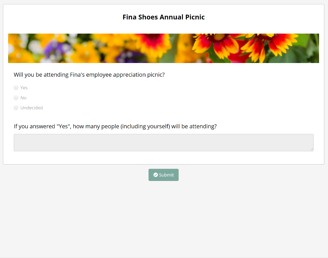
- Banner Tall - Displays the image at 50% of the learner's screen height using the full width of the form.
Title
A name for the image.
Alt Text
The alternate text that describes the image or its functionality.
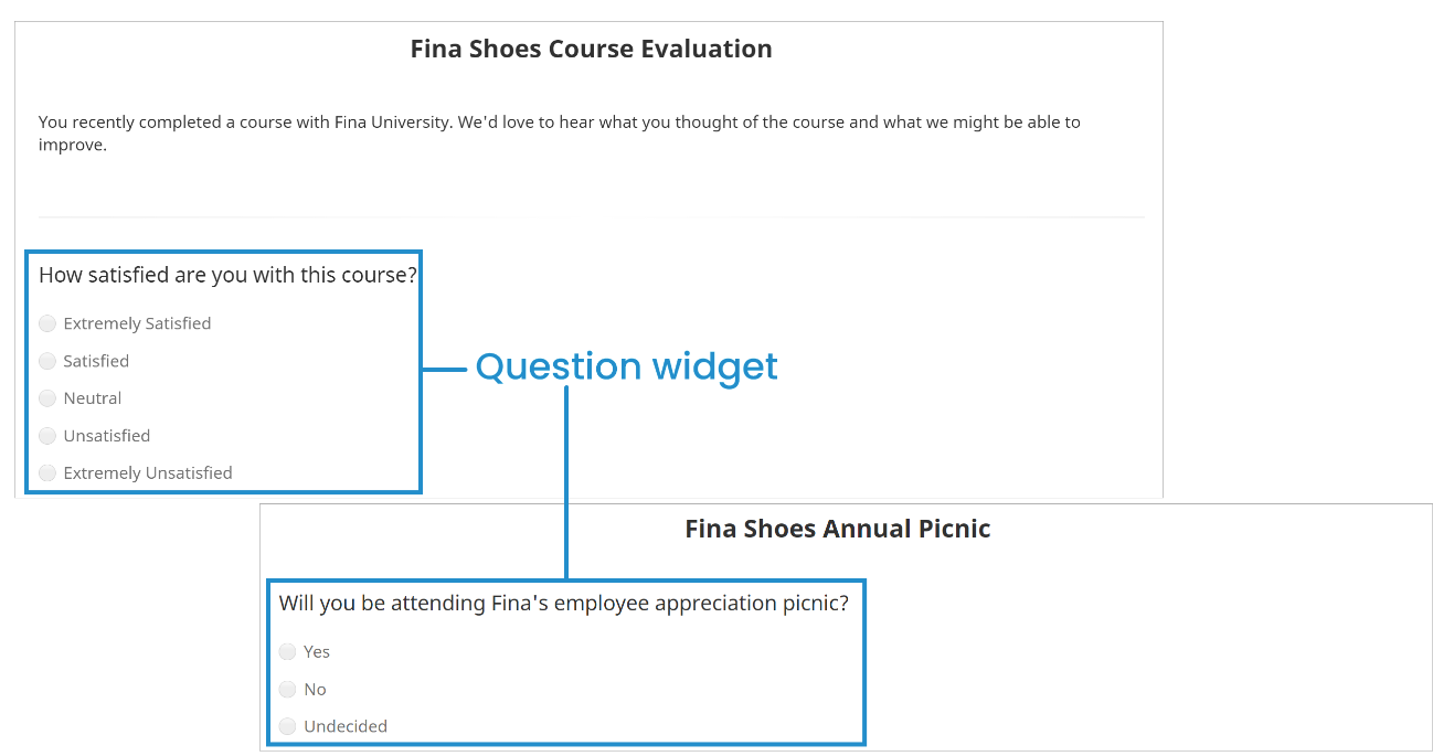
Question
The Question widget inserts a multiple choice question in the form.
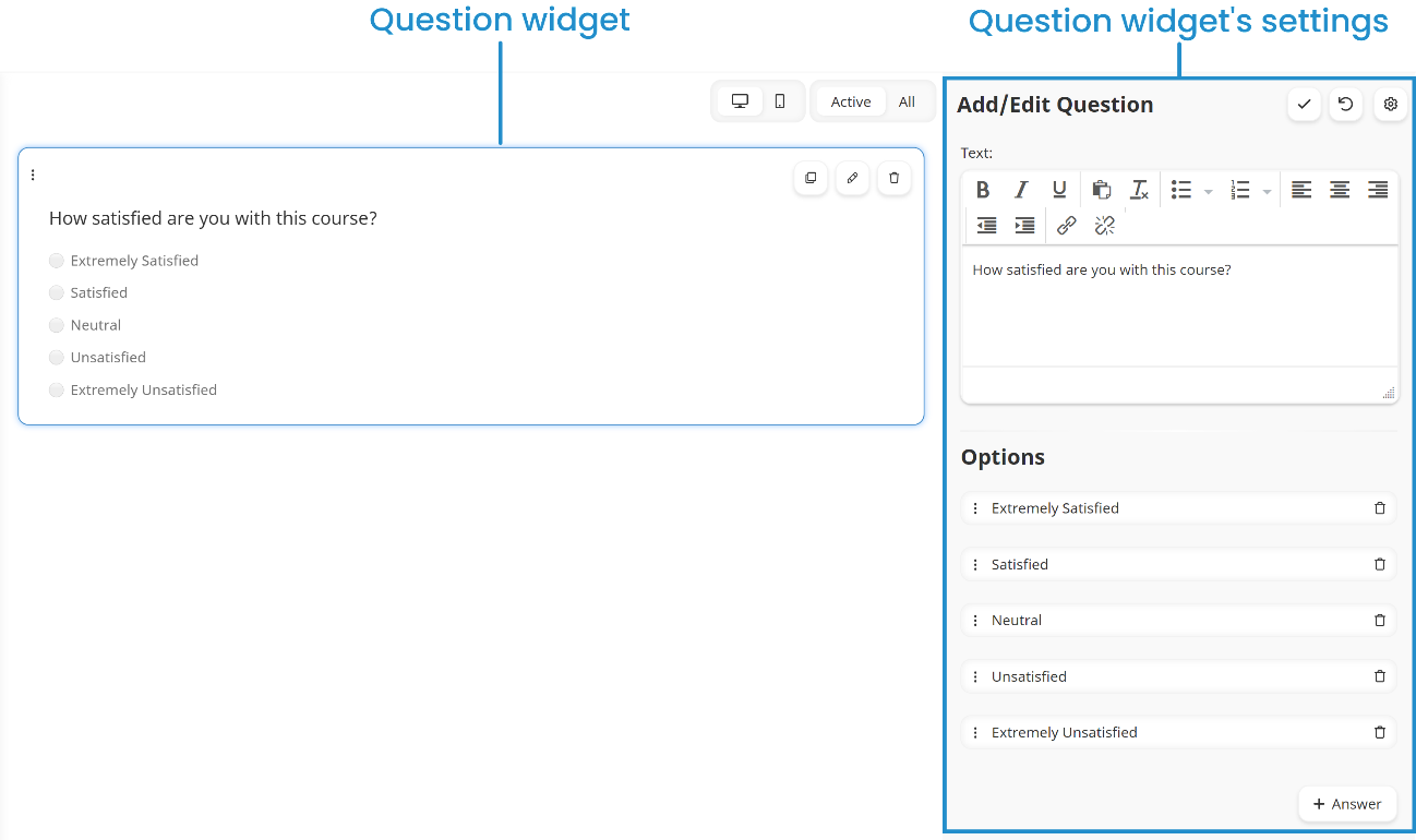
You can edit the Question widget's settings that are listed below.
 to access some of the settings below.
 Text
The question text.
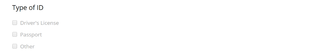
Options
The responses to the question.
To change the text displayed, click the text and edit it as needed.
To reorder the options, click the  and drag the option to its new position. If the
  has focus, you can also use your up and down arrow keys to change the option's position. When you're ready to drop the option, press the spacebar.
To remove an option from the question, click the  .
.
Status
If enabled, the widget displays on the form.
Required
If enabled, the learner must select an option before they can submit the form.
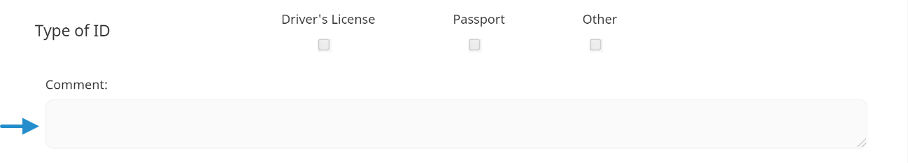
Orientation
Select how the options display on the form:
- Horizontally - The options display from left to right.

- Vertically - The options display from top to bottom.
Enable Multi-Select
If enabled, learners can select more than one option for the question.
Prompt for Comment
If enabled, an additional field displays where the learner can enter text about the question.
Required
If checked, the learner must enter a comment for the question before they can submit the form.
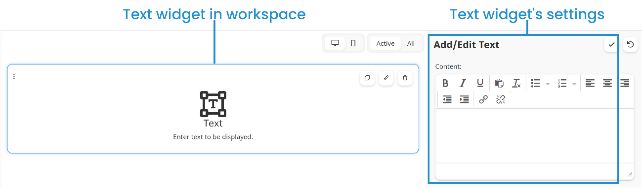
Text
The Text widget inserts content in the form.
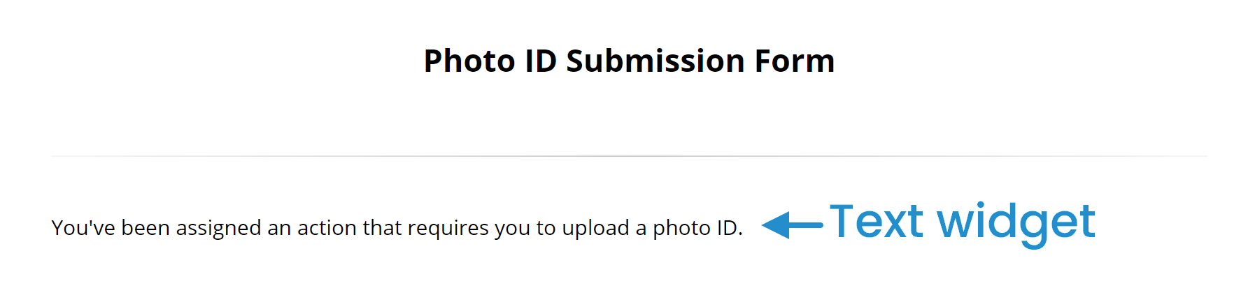
You can edit the Text widget's settings to include content such as instructions or other information in the form.
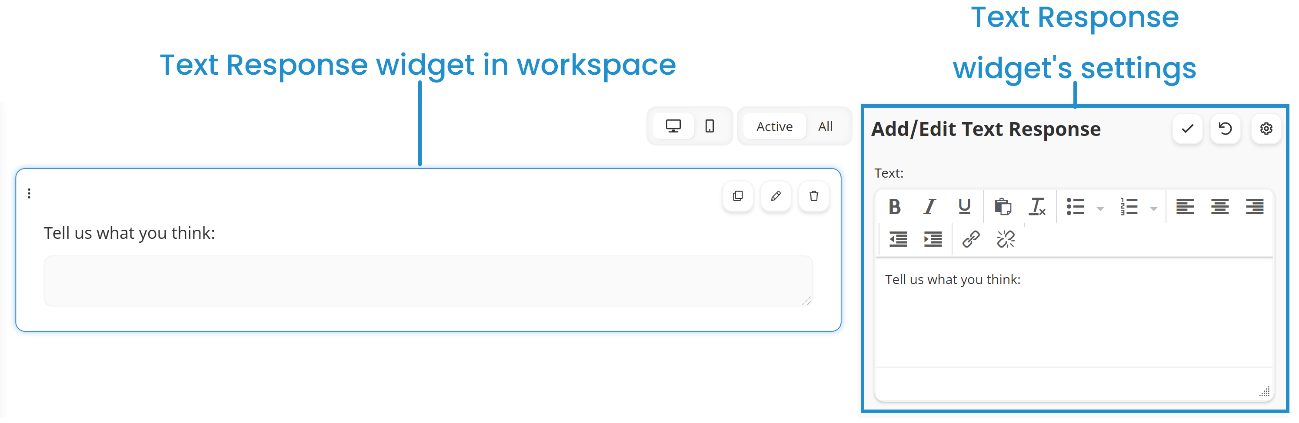
Text Response
The Text Response widget inserts a text field in the form.
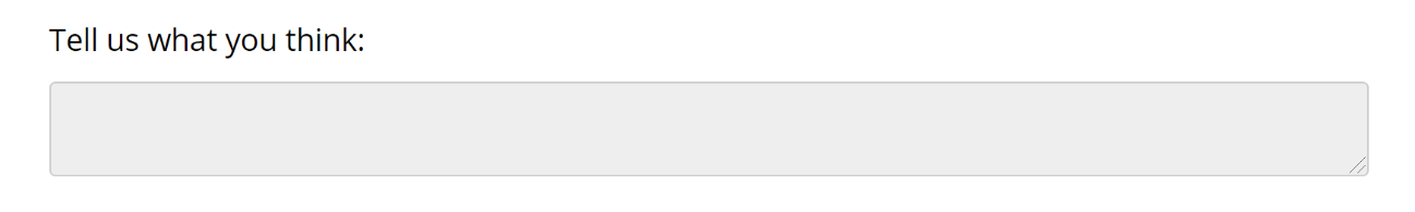
You can edit the Text Response widget's settings to include instructions in the form.
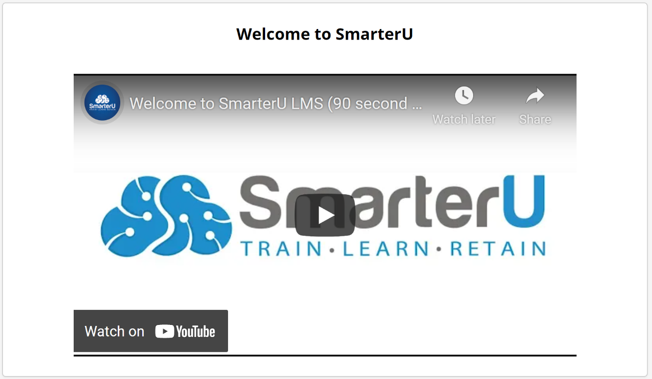
Video
The Video widget inserts a video in the form.
You can edit the Video widget's settings that are listed below.
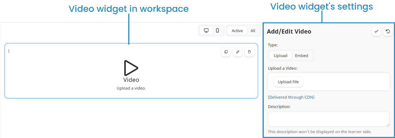
Type
Select one of the following options:
- Upload - You would like to upload the video's file.
- Embed - You would like to embed code to access media that's been uploaded to another site.
Upload a Video
This setting is only available when the Type is set to Upload. To upload a video file, click Upload File.
Embed Code
This setting is only available when the Type is set to Embed. Enter the embed code for the video.
Description
A description of the video.