As LMS admins and HR professionals, we want to make training delivery efficient and stress-free for learners. One way to facilitate this is to centralize training and resources within the LMS. Rather than using multiple applications and trying to keep them in sync, use SmarterU LMS to create and manage your organizational training and knowledge in one place.
This article will focus on SmarterU’s knowledge base and how you can use it to manage your resources.
Want SmarterNews delivered to your inbox? Subscribe today!
What is a knowledge base?
The knowledge base is where you can create, store, and manage resources within SmarterU LMS.
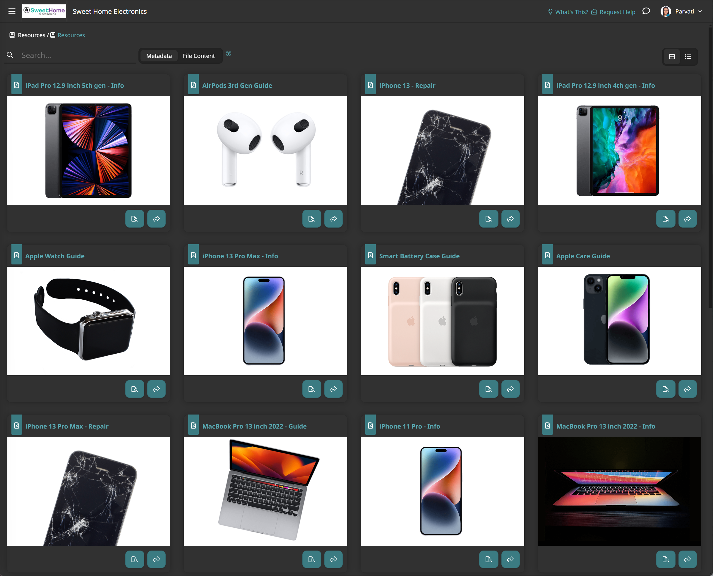
For example, if you are a manufacturing company, you may use the knowledge base to store your safety guidelines, operation manuals, and quality control checklists. If you are a retail company, you may use it to centralize your employee handbook, product catalog, and marketing materials. In the healthcare industry, you can add policy documents, regulatory updates, and patient education materials.
SmarterU’s knowledge base allows you to create two types of resources: files and articles.
FilesUpload over 40 file types (including images, videos, documents, etc.).
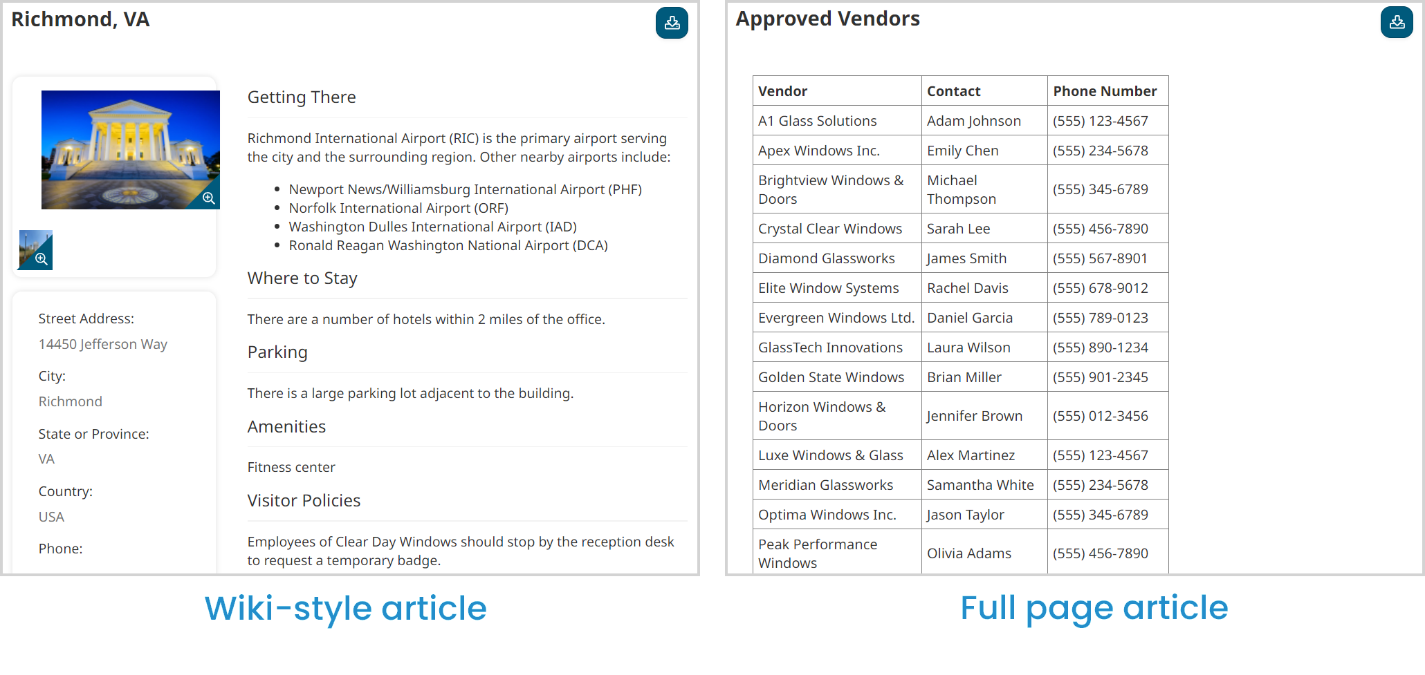
Create both wiki-style and full-page articles.
You can then use folders to organize your resources and manage access to them. You can also manage access to individual resources.
You can easily share your knowledge base with learners using a knowledge base page — either pre-filtered by tag (we’ll talk more about tags later) or a specific folder.
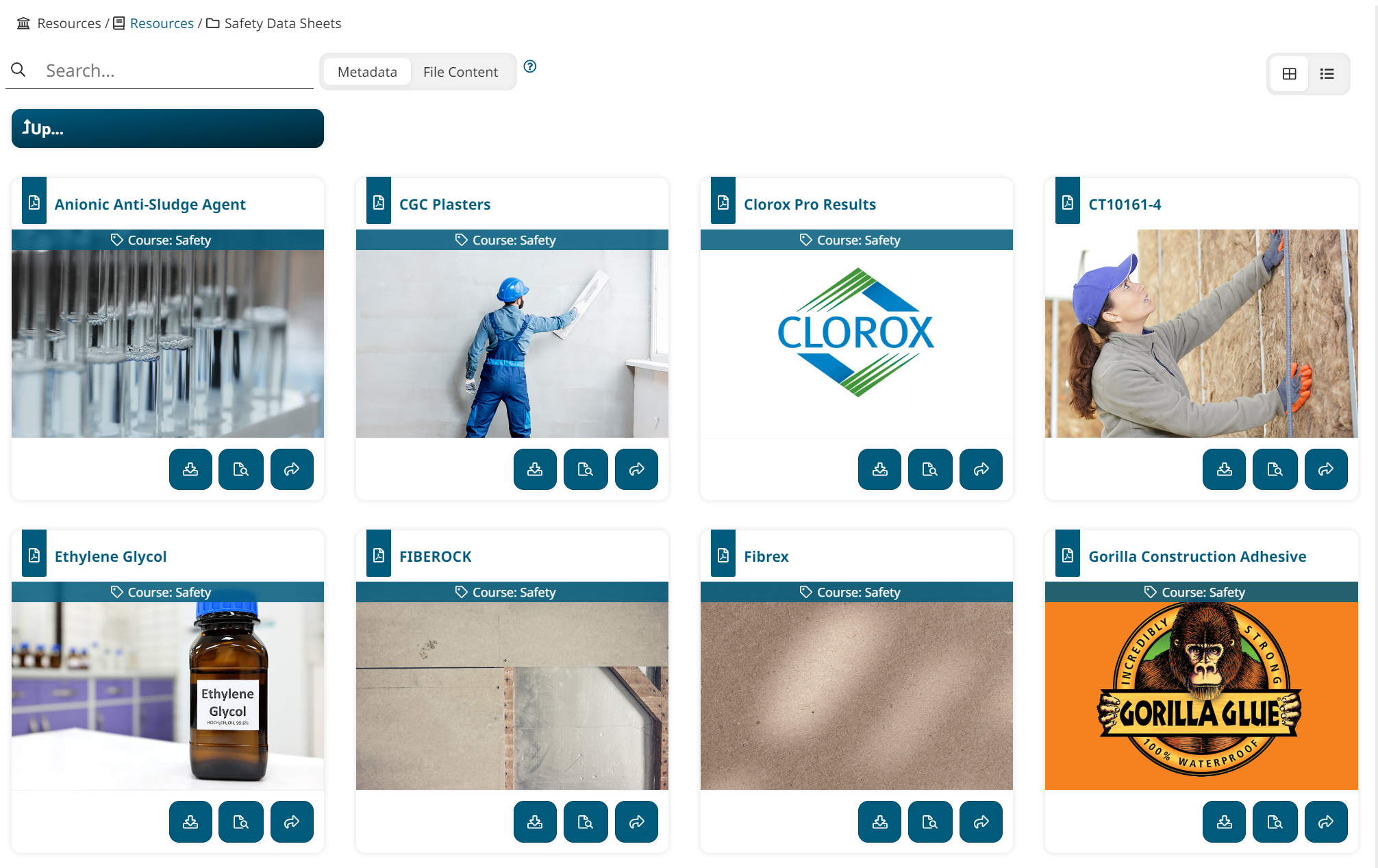
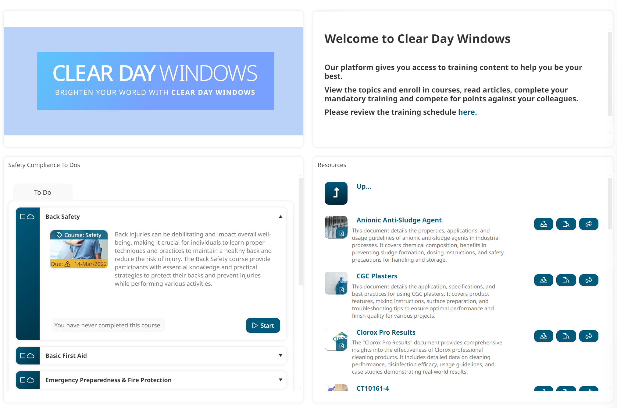
Alternatively, you can add a knowledge base widget to a custom page to share courses and resources side-by-side.
Organize Your Learning Resources for Success
The organization of your knowledge base is critical to its success. If learners can quickly find and access relevant resources, your knowledge base will become a pillar of your learning environment that people use repeatedly. On the other hand, if learners have to spend time searching for what they need, they will find the information elsewhere (like on Google) or not at all.
What is the best way to organize your content?
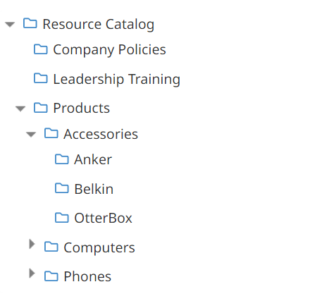
Within SmarterU, you can organize content within your knowledge base using folders and sub-folders. Think about what hierarchy will be most intuitive and easily understood by your learners. Pick a logical, easy-to-explore structure that doesn't need explanation.
For example, identify some broad content categories, such as company policies, products, and leadership training. Then, break these categories down into more specific pieces. For example, you may want to create a folder called “Products” that contains sub-folders for “Phones,” “Computers,” and “Accessories.” Within each sub-folder, you can create more granular sub-folders for specific brands of products.
You can further organize and group related content in your knowledge base using tags. Tags are keywords you can associate with content to make it easier to identify and search for. Tags also allow you to associate resources across different folders.
For example, you may add tags based on topic (e.g., leadership training, onboarding), department (e.g., Sales, Manufacturing), resource category (e.g., HR resource, product manual), or brand (e.g., Apple, Lenovo).
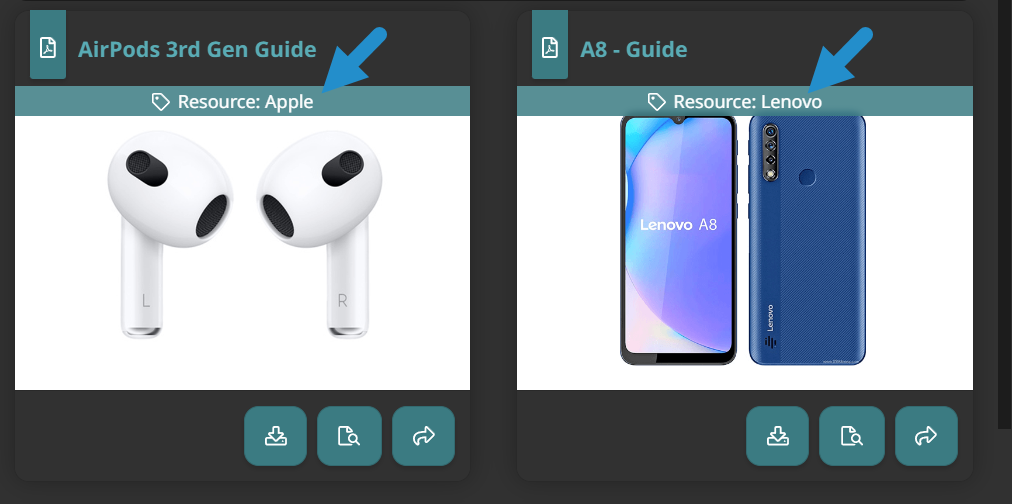
To learn more about tags, read our previous SmarterNews article: Use Tagging to Enhance your Learner Dashboard.
When creating your folders and tags, use descriptive names so learners can quickly identify each object and scan for specific resources.
Benefits of Well-organized Content
Learners are much more likely to access information in your knowledge base when it is easy to find. Typically, learners scan for content at a glance or use the search feature, so consider both.
A well-organized knowledge base:
improves learner efficiency, reducing the time spent searching for information
increases engagement with important supplemental resources
empowers learners to seek out information and resources within the knowledge base
Make your Knowledge Base Visual with Thumbnail Images
When creating the individual resources in your knowledge base, consider how they will appear to learners.
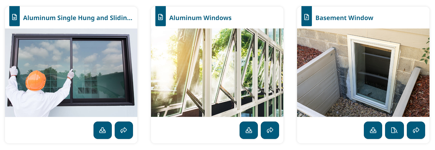
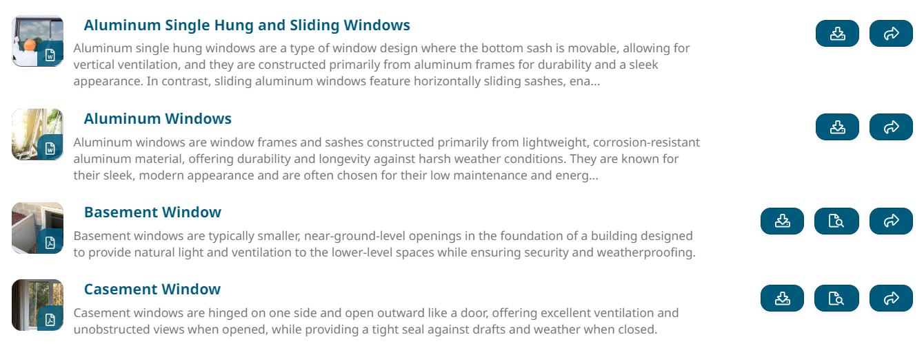
Thumbnail images are one of your knowledge base's most visually striking parts. You add these images when creating each resource. Depending on how learners view your knowledge base—as tiles or a list—these images will vary in size and prominance.
The tile view prominently features each thumbnail image and is perfect for making your content stand out. To make the most of this format, we recommend customizing each image to capture learners' attention and allow them to scan your resources.

While the list view is more condensed, learners often use thumbnail images to identify relevant content quickly. Therefore, we recommend using color or other design elements to distinguish between types of content or topics.
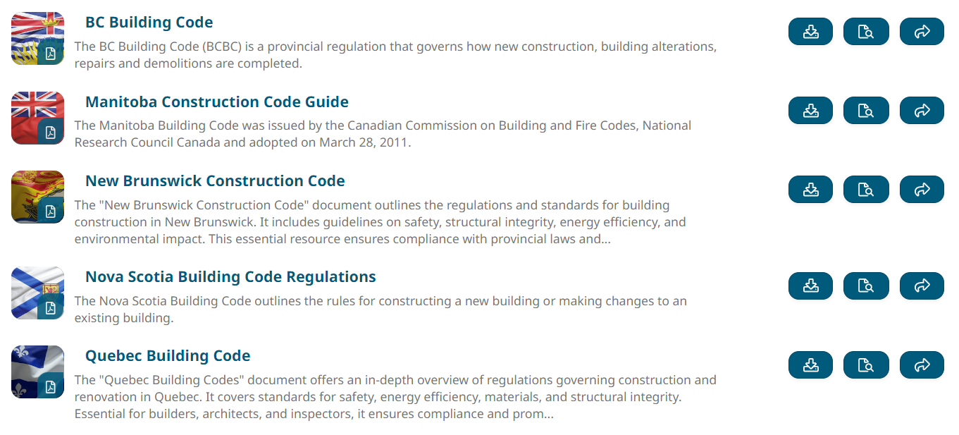
What makes a good thumbnail image?
Good thumbnail images are useful, informative, and allow learners to scan your content.
When choosing a thumbnail image, consider the following:
Is it relevant? The image should relate to the resource it represents. For example, if you have a resource about using Microsoft Excel, you can represent this with an image of the Excel logo or a spreadsheet.
Is it clear? Make sure your images are high-resolution, simple, and easy to understand. Remember, these images will be small (even smaller in the tile view), so learners won’t be able to see many small details. For this reason, we also recommend avoiding images with a lot of text.
Is it consistent? Use similar images for similar resources. For example, if you have several employee contact sheets, consistently use each employee’s corporate photo as the thumbnail. As another example, if your knowledge base contains 20 operation manuals, use a similar image style for all 20 to make them easy to spot amongst your other resources. Staying to a similar style and color palette will also look more visually appealing.
If you plan to display your knowledge base as a list, simple images and color-coded thumbnails allow learners to differentiate between content at a glance.
For example, if you are creating a resource library for a manufacturing company, you may:
use a shield icon on a purple background for safety-related resources
use a wrench icon on a green background for product manuals
use a book icon on a blue background for policy documents
Benefits of a Good Thumbnail Image
As we’ve alluded to in the previous sections, there are many reasons to dedicate some time and consideration to choosing your thumbnail images.
Good thumbnail images:
facilitate scanning your content, allowing learners to find the resources they need more quickly
improve engagement by quickly capturing learners’ attention
enhance content organization by making it easy to recognize related content visually
foster trust by professionally presenting resources tailored to your organization or brand
provide context through visual cues, such as color or style
Write Informative Descriptions
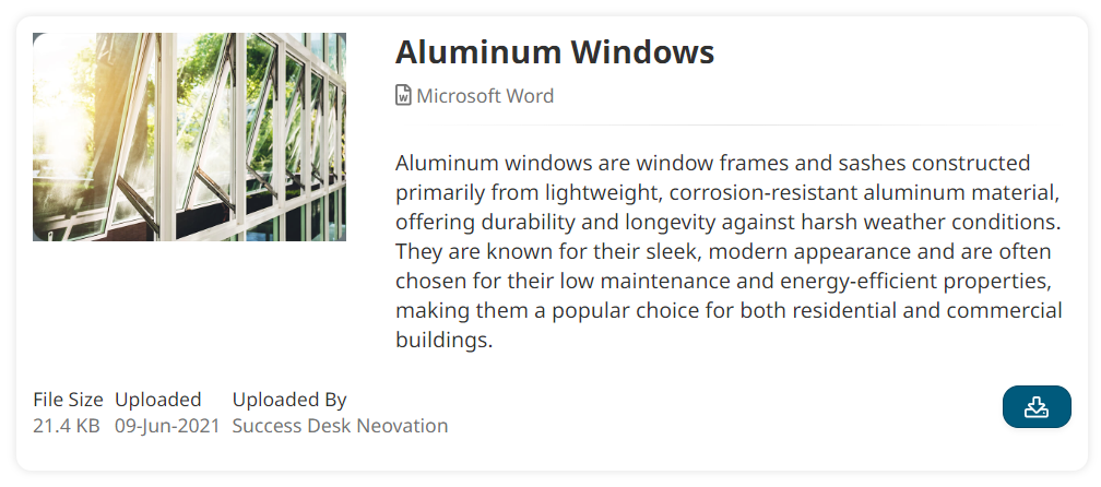
When adding to your knowledge base, consider how your resource descriptions will appear to learners. A resource description is a short overview of a resource's content. It typically includes key details that help learners to identify, categorize, and understand the purpose of the resource. This information lets learners quickly determine whether a resource is relevant to their needs.
Resource descriptions are most prominent when accessing the knowledge base using the list view. Since only 300 words are shown, we recommend listing the resource's main topics, objectives, or benefits in the first part of your description.
Learners can then click on the resource to see the full description, where you can provide much more detail, include lists, and share links.
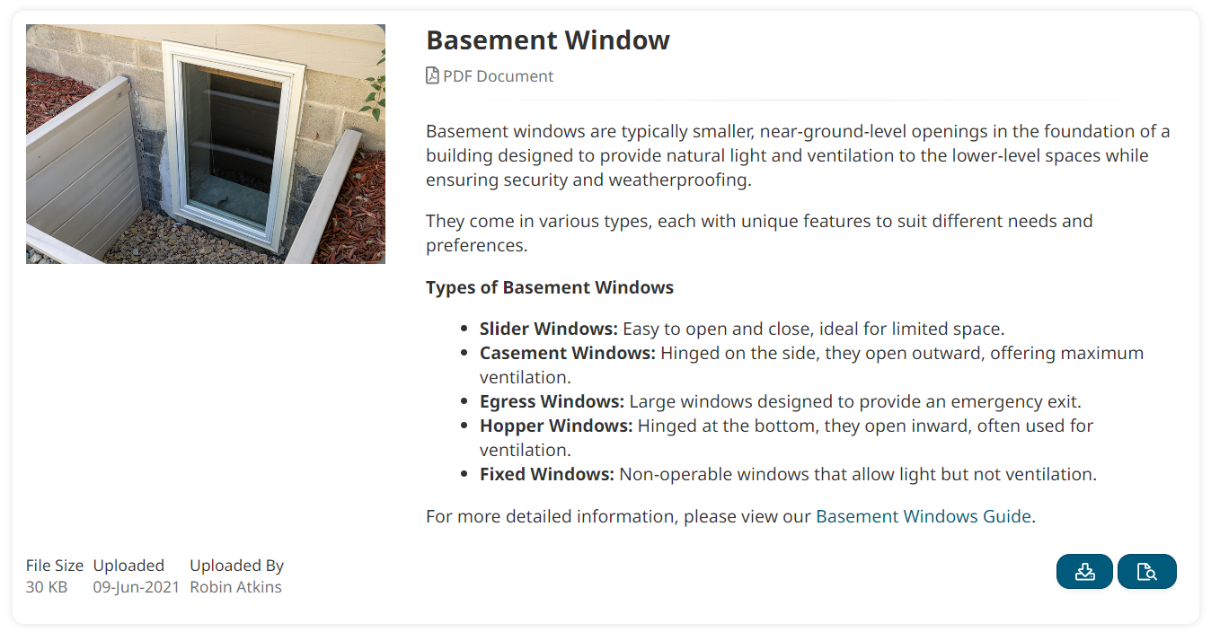
When using the tile view, descriptions will only appear once you click on a resource.
This emphasizes the importance of choosing compelling thumbnail images that are not purely decorative but also convey helpful contextual information.
What makes a good resource description?
Good resource descriptions are informative, clear, and concise.
When writing a description, consider the following:
Is it informative? The description should tell learners what the resource is about. For example, if you have a downloadable Word document in your knowledge base, your description may provide a list of topics covered in each chapter. This information tells learners what to expect and helps them decide whether to download the document.
Consider what information learners need to get the most from the resource. For example, a good video description allows learners to decide whether to invest time in watching it. But if you take things a step further and provide timestamp information, you can enable learners to scrub to the exact point in the video with the necessary information.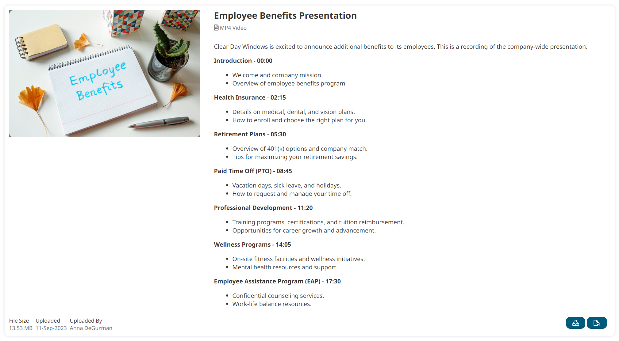
Is it clear? Write descriptions that are easy to scan and understand. For example, break up your description into a bulleted list instead of writing a long paragraph. A good description tells learners precisely what they can expect.
Is it concise? Write descriptions that are brief and to the point. If your learners want to learn more, they can click to view the resource. While you want to limit the number of words you use, remember to be specific and not vague.
If you’re unsure where to start, many AI tools (some free) are great at writing summaries of various content (e.g., documents, scripts).
Benefits of a Good Description
A good resource description helps learners quickly determine whether they want to spend time and effort exploring a resource.
Further, good resource descriptions:
provide context, allowing learners to determine the resource’s value quickly
guide learners by telling them what resources contain before downloading them
improve searchability since SmarterU’s knowledge base checks both resource names and descriptions for search terms (plus, this ensures non-text resources, such as videos, are included in search results)
save learners time by summarizing long resources, such as multi-page PDF documents or webinar recordings
Why Searchability Matters
Throughout this article, we’ve mentioned searchability: the ease with which learners can find relevant information in the knowledge base.
Easily searchable content is essential for creating a smooth learning experience. When content is easy to find, learners can spend more time learning and less time trying to find what they need. Further, when learners can painlessly find relevant, informative resources, they are much more likely to use them rather than a random site they found on Google or simply guess what they need to do.
Because easily searchable content makes learners more efficient, saves time, and enhances learning, it also tends to positively impact overall user satisfaction and engagement.
Customize Further with a Custom Page
Want to take your knowledge base content a step further? Create a custom page!
Using a custom page, you can present your resources alongside your courses — closely tying together assigned training and related documents.
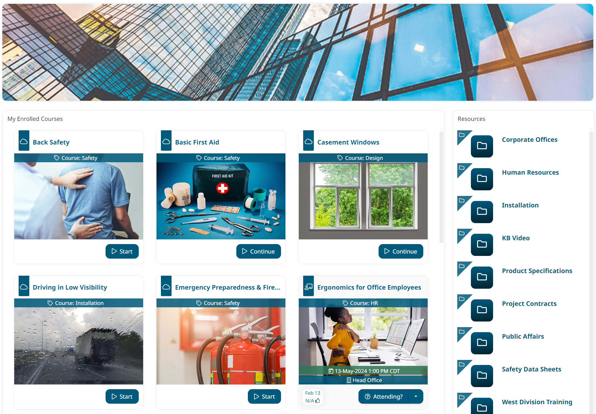
Alternatively, you can use a custom page to present multiple knowledge base widgets in one place. Each widget can be customized to show specific information, allowing you to create an experience catered to your learners' needs.
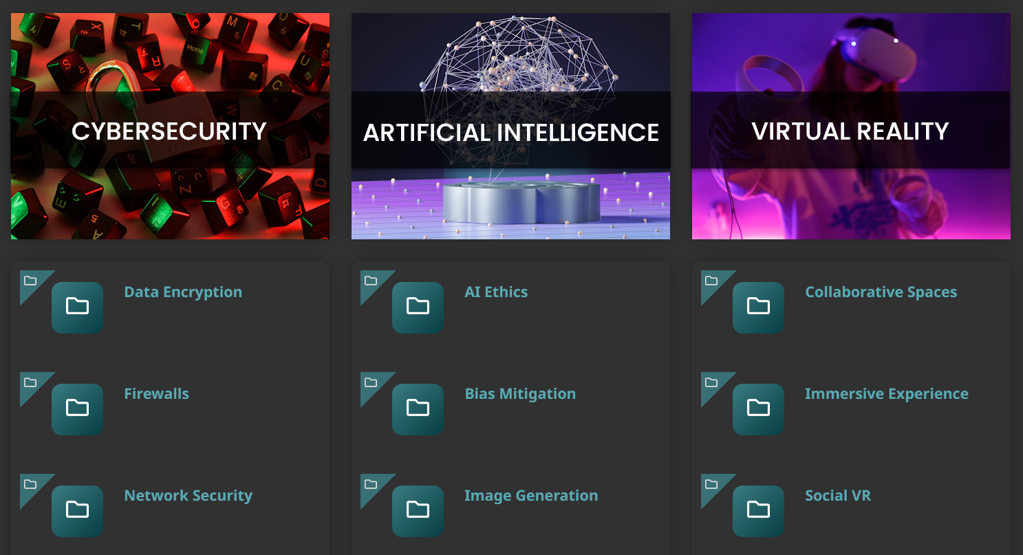
For more ideas and to learn more about creating a custom page, check out Create a Resource Library with our Knowledge Base & Custom Page Builder.
In conclusion, enhancing the visual appeal of your knowledge base in SmarterU LMS can significantly improve the learner experience. By considering how to organize your resources, adding good thumbnail images, and writing clear descriptions, you can enhance your knowledge base's navigation, searchability, and overall usability. In turn, you’ll have happier learners who can quickly find the information they need whenever they need it.
Do you have questions about this feature or any other aspect of SmarterU LMS? Contact our Success Desk.
